Switchpoint
Mobile application for sharing reliable, up-to-date and relevant information on renewable energy and sustainable practices.
Context
I collaborate with Luna Nancy and Romain, each member of the group was asked to carry out research into digital solutions for accessing information as well as documentary research into the user experience of accessing information, more specifically environmental information. We explored several innovation workshop methods. We were also involved in designing a user journey, producing wireframes, designing interfaces around the user journey and prototyping the various screens.
Goal
The goal of this project was to experiment with different principles, methods and approaches used
in UX design.
We decided to target people aged between 20 and 35 who are already environmentally aware. The
problems that our target may face when it comes to information on renewable energy and
sustainable
practices concern, on the one hand, the authenticity of the information presented to the user
and,
on the other, our solution must avoid generating anxiety and making the user feel guilty.
Approach
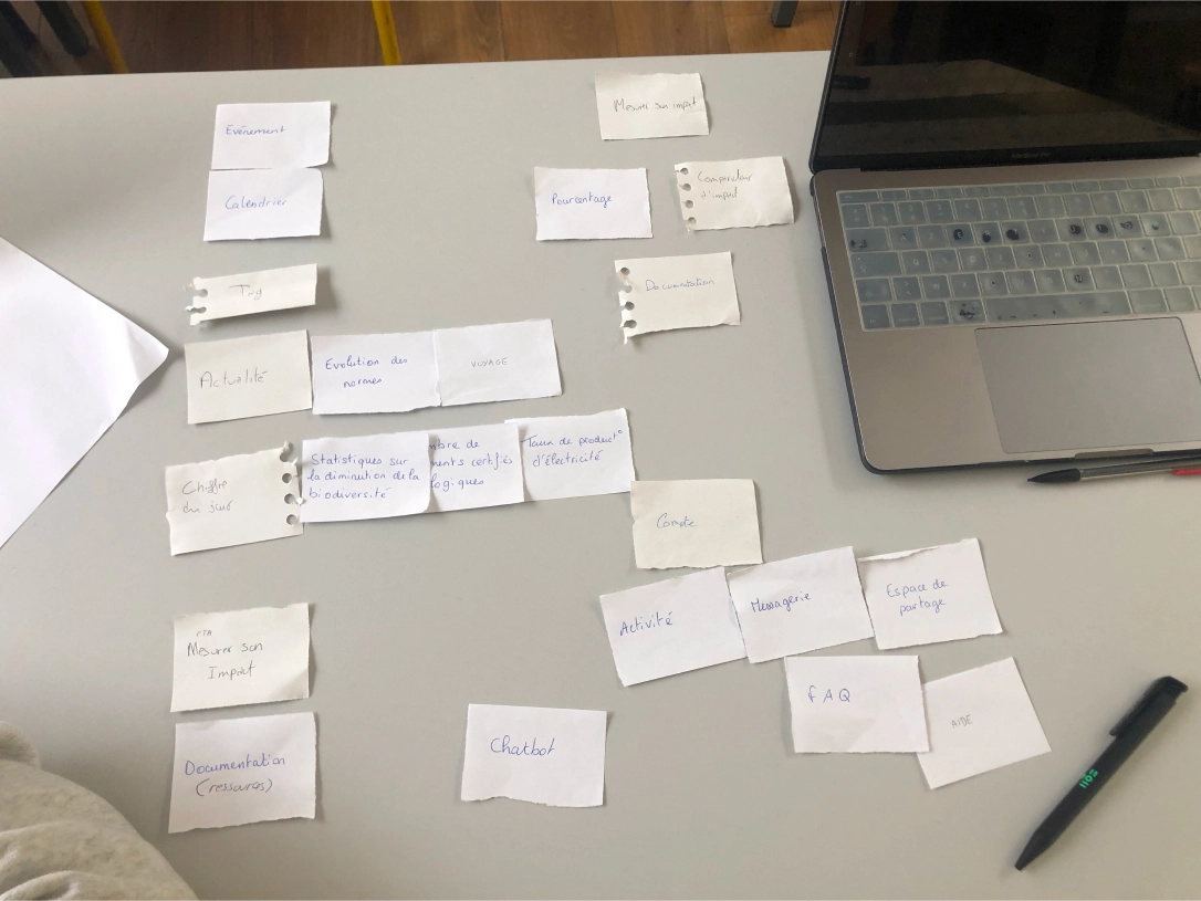
We initially used the card sorting method, working in pairs. This method enabled us to categorise the content of our product according to a coherent structure that could be quickly understood by end users. After the workshop, a feedback session with the 2 pairs enabled us to discuss the 2 solutions we came up with. Luna and Nancy explored the idea of an application focusing on ecology-related events, while Romain and I explored the idea of a web platform covering the various environmental trends.
Following the feedback we converged on a solution consisting of a mobile application that would create social links through eco-responsible events and provide the latest information on environmental issues.
Last steps
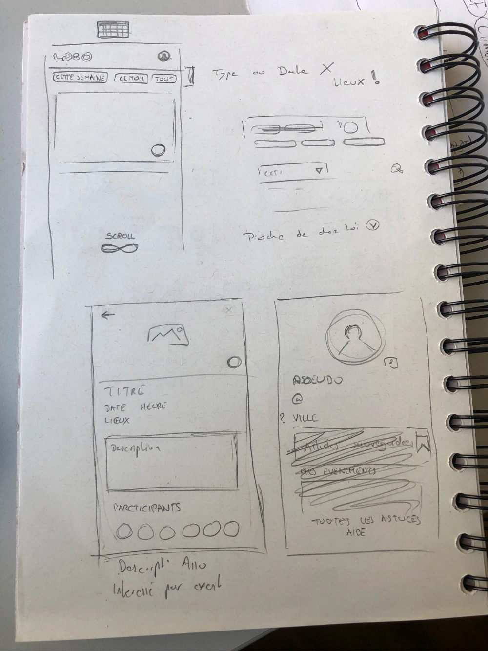
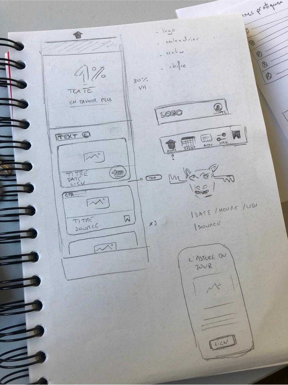
We then designed our screens on paper so that we could quickly and easily give shape to our ideas. Choosing to start on paper gave us a lot of flexibility and allowed us to focus on the essentials without being distracted by trying to create something that was graphically perfect. Finally, we designed the UI and prototyped the different screens on Figma.
Challenges faced
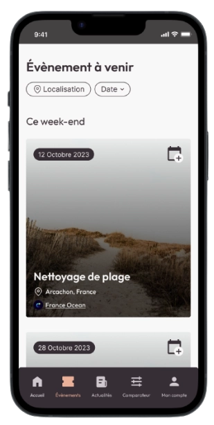
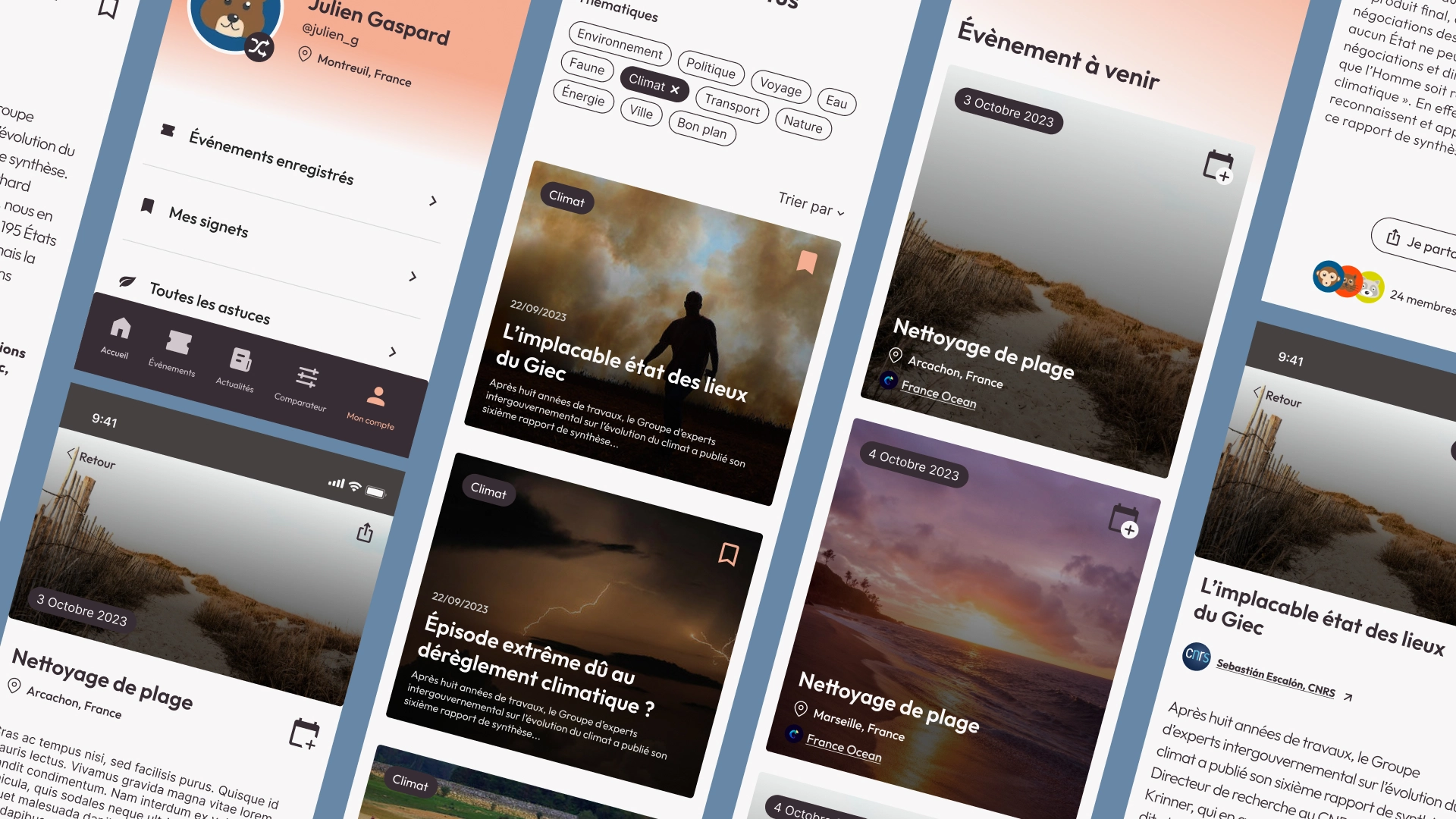
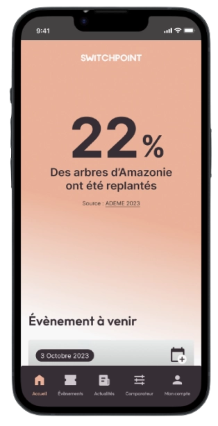
Home screen
- - Limit eco-anxiety and associate the app with positive news
- - Highlight upcoming events
- - Make our ecological tips playful
- - Display the most popular articles
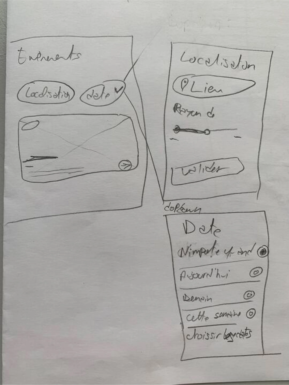
Events screen
- - Display events close to the user's home by default
- - Reduce cognitive overload by separating events by chronological order
- - Allow users to browse events by date